
Text and images do not always get along well together in HTML. Here's some tips to help make these two HTML partners get along better:
-
Understand that confining too much text to too small an area is almost always a problem.
Here's the reason why: HTML does not define text as precisely as you would like it to. Specifically, HTML does not define text in the same precise, pixel-perfect sense that images are defined.
In an image, each pixel can be precisely defined by you.
Text is different from images. Text needs breathing room. Why? Because the way text is defined is browser dependent.
Therefore, when text and images collide, it is as if you had mixed building materials with different expansion characteristics. Something is going to have to give.If you pour concrete without expansion joints, the concrete cracks.
Confined text cracks everything around it. Specifically, the text expands and puts ugly cracks in your images. These cracks show up as straight lines separating images.
These cracks can be hard to discover if they happen to show up in one browser but not in another.
-
The only shape HTML provides for containing text is the rectangle.
All text is rectangles.
Of course, if you are clever, you can stagger your text rectangles in such a way as to break up the blocky look that text can take on if you have not successfully disguised this fact.
Disguise it. You don't want your web page to look like a grid.
-
If you wish to make a triangle out of text, place hard breaks in the text and center it.
This works well with article titles that are too long to fit on a single line.
For the best possible look, make the bottom-most line the widest line so that it may serve as the base of the triangle.
-
Utilize the basic controls that HTML and Cascading Style Sheets (CSS) give you to control text.
Here are some things you do have control over:
-
You can choose the font family -- arial or palatino, for example.
-
You can make your text bold or normal.
-
You can choose the height of your font.
-
You can choose the height of the line that the font resides in.
Choosing too narrow of a line height causes your line to go careening into the next line of text and makes it hard to follow with the eye. Choosing just the opposite -- a line height that is too high -- gives your text an undesirable double-spaced look.
-
You can align the text -- either to the left, right, or center. You can even do all three at the same time.
This is called full justification and aligns the text on the left and the right and therefore, by necessity, in the center as well.
Full justification is accomplished by letting the browser place extra spacing between words. The spacing in the fully justified line is evenly spread across the words in that line.
-
-
You should try to float images inside of text rather than try to float text inside of surrounding images.
This is especially true if the text is surrounded on all four sides by images that are a fixed distance from each other.
Think river. The text is the river and the images are boats floating on that river.
Why a river? Because the water is able to expand and contract as it flows around the boats which are forever changing their distance from each other.
Boats, on the other hand, have fixed widths and lengths and cannot expand and contract when they come in contact with other.
Like boats, images that collide with each other crack.
Like water, text flows around images in HTML.
-
Images can be floated to the left or the right in a text box.
This is one technique for breaking up the blockiness of text.
Floating an image to the left causes the image to hug the left side of the text box. Floating an image to the right causes the image to hug the right side of the text box.
An image that is floated left or right acts as a margin for the text that follows. The text that follows the image is placed right beside it.
If there is more text than image, the text continues to flow right on past the image. The old margin is re-established again once the text has successfully gotten past the image.
In other words, an image that has been floated all the way to the right or all the way to the left becomes the new right or left margin for the text. This is a temporary effect that only lasts as long as the image itself.
More precisely, the horizontal margin is offset by the width of the image for the entire vertical distance that the image is found to be interrupting the text flow.
-
Text that is blocked in on all 4 sides will rebel if it doesn't fit.
Placing images on all 4 sides of text can cause the text to push the bottom image down which then opens up a break between the image above and the image that is below. This break shows up as a line going across the web page.
The only thing that will prevent this from happening is if the aggregate text is smaller than the space that confines it.
-
There is always room for more text at the bottom of a web page if the bottom of the page is left open.
What is an open bottom? It is a web-page bottom that is able to accommodate more text without having to resort to a redesign of the site.
What is a closed bottom? It is an image at the bottom of the web page that is a fixed distance from images above it.
Typically, web designers unintentionally close the bottom of their web pages by taking a picture-frame approach to their design. The text is the picture and the surrounding images are a frame that tries to fix the text in place.
The keyword here is tries. Framing text like this makes the design brittle and prone to breakage when modifications to the text are made.
For this reason, almost all successful web pages have open bottoms. This is normal and is found everywhere on the web.
This is not to say that you cannot put an image at the bottom of your web page. It does suggest, however, that you would be wise to float this image at the bottom of the text rather than fix it in place.
-
In HTML, solid colored boxes are easy to shrink and expand in tandem with shrinking and expanding text.
One of the easiest things to create in HTML is a text box that has a solid color box right next to it that is the exact length of the text -- whatever that length happens to be.
Solid colors are both easy to create and easy to expand in HTML and are a good way to reduce browser-specific dependencies.
Of course, you can float images in the solid color boxes just like you float images in text.
-
If you wish, you can replace your expanding solid color boxes with repeating patterns.
A repeating pattern is a small image that repeats. These act like colored boxes but give your web page a texture instead of being limited to just solid colors.
-
The easiest possible way to deal with text is to put it all in one rectangle.
Do this if you are pressed for time. Your rectangle will expand endlessly at the bottom. Allowing text to expand at the bottom of your web page will allow you to meet your deadline.
-
No two browsers render text exactly the same.
Text is the wildcard of web design in the sense that you do not have absolute control over exactly how it is rendered.
Why? Because the HTML specification does not provide any way for pixel-perfect rendering of text that is entirely consistent from one browser to the next.
It's true that you can specify the pixel size of your font. However, this does not guarantee a result that is precise enough to allow you to predict exactly where words will wrap and exactly where the text block will end.
-
Here are some nice ways to break up the blockiness of text:
- Use small images to start paragraphs.
-
Use images that float all the way to the right or left.
An image that is floated all the way to the left or right gives the text something to flow around. It's as if the text were water flowing around a big rock that extends out far into the river from the river bank.
Floating images to the left and right like this can be used to create a nice text meander that winds its way down your page like a river that snakes across a nearly flat plain.
This meander creates visual interest that keeps your reader reading.
-
Use images that are centered in the text and go with the flow of text.
As your text moves downstream more, your centered image will too.
In effect, a centered image in a text block is just another paragraph in that text.Don't try to align this centered image with anything that is beside it. If you try this, you will find this to be an exercise in frustration as the centered image is really a part of the text box that contains it and not a part of anything outside of it.
-
If you must have absolute control over your text, make your text a text image rather than real text.
A text image is similar to a photograph of text. You can create text images with an image editor such as Adobe Photoshop.
Text images have the advantage of not varying at all across different browsers and across different versions of the same browser.
However, do not overuse text images. They are not always cataloged by search engines.
Something to keep in mind: Beneath the surface, the World Wide Web is a text animal, not an image animal.
-
Remember that HTML is a text animal first and an image animal second.
It's easier to tie an image to text than it is to tie text to an image.
Where possible, let your image float to its eventual location as determined by the flow of the text.
-
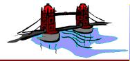
Make large text an image.
Big text, such as found in logos, should be image text rather than real text. There are practical limits to how large you can make text in HTML and make it look good.
-
Accompany image text with alternative text.
Be aware that image text should be accompanied by alternative text so that it can be read by the search engines. Additionally, you should provide your image with a title for the same reason.
HTML provides the TITLE and ALT attributes for this purpose.
The title is generally a pithy little caption that describes the image in very few words. The alternative text is different. It is much more verbose because it is assumed that you are reading the alternative text because you can not view the image.
Write the alternative text -- not as a description of the image -- but as a way of experiencing the image without ever having seen it.
-
If you remember nothing else from this article, remember these 2 points:
-
Don't place images and text next to each other and expect both to be exactly the same length down your page.
This is especially true for long runs of text. Images are guaranteed to always be a precise vertical length down your page. Long runs of text are guaranteed to never be a precise vertical length down your page.Remember! Text varies in appearance from one browser to the next.
-
Always leave the bottom of your text box open for expansion and contraction.
Once again, this is especially true for long runs of text.
-
-
Understand that web page layout is not the same as magazine page layout.
Understand this and you will have a much easier time of it.
If you have trouble grasping this point, perhaps it is time to sit down with pen and paper and list for yourself some of the differences between web design and magazine layout.
An experienced web designer should be able to come up with a list of at least 10 reasons why web site layout is different.
Most of the mistakes detailed above will go away if you will stop trying to lay out your web page in the same fixed-position fashion that you would use when doing a magazine advertisement.
Web design is not magazine layout. Know the difference or suffer the consequences.
Further Reading
How to Get Rid of Spaces Between Images in HTML
©Edward Abbott, 2004. All rights reserved. Revised June 7, 2004.
Questions or comments? Email me at ed@WebSiteRepairGuy.com.